
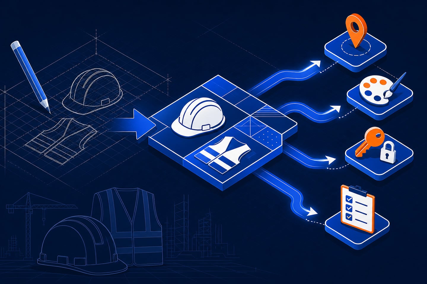

Every order your B2B portal fails to capture becomes a call to your sales team. That gap has a direct cost: lost rep time, slower fulfillment, and revenue that never reaches checkout. This eCommerce UI UX case study documents how Atwix redesigned the buyer experience for PowerPak, a safety equipment supplier serving New York’s Tri-State area. The work addressed four specific failure points in the B2B buying journey: delivery visibility, product customization, account authentication, and procurement list management. The measurable result: 230% eCommerce sales growth, 89% eCommerce retention, and a 6% reduction in cost per order.
PowerPak B2B Portal Redesign at a Glance
| UX Problem | Root Cause | Atwix Design Decision | Design Objective |
|---|---|---|---|
| Buyers could not confirm same-day delivery before ordering | No delivery date is displayed across product listings, product pages, or the cart | Built a ZIP-code-based Delivery Date Estimator, always visible in global nav | Allow buyers to make purchasing decisions based on location-specific availability and delivery speed |
| Branded PPE orders required a manual quoting step outside the portal | No on-site configuration tool for logos, colors, or print positions | Designed an interactive customization flow with real-time per-item pricing | Enable buyers to configure products with logos, colors, and print positions on the PDP, with real-time cost feedback |
| Multi-user B2B accounts faced friction during login and onboarding | Generic single-step login could not route company-invited users or new registrations | Built a dynamic sign-in system, routing users through four flows based on account status | Provide a unified, streamlined sign-in experience across all four user types and account statuses |
| Procurement managers could not sort, share, or manage requisition lists at scale | The requisition list UI lacked role-based sharing, sorting, and updated product cards | Redesigned product cards, added sorting, simplified editing, and added company-wide share controls | Improve requisition list usability and collaboration for multi-user company accounts |
The Client Problem: A B2B Portal That Could Not Keep Pace with Same-Day Orders
PowerPak has served New York’s Tri-State area for nearly three decades. Their entire business model depends on urgency. When a job site runs out of safety vests or lifting slings, construction stops. PowerPak’s value proposition is same-day delivery, and that depends on a digital ordering system that converts without friction.
By fall 2022, their Magento Commerce platform (now rebranded Adobe Commerce) was failing that test. The storefront struggled with high-volume B2B orders, offered no real-time delivery estimates, and had no self-service customization for branded PPE. The login experience was built for a single user type, not for the multiple roles within a B2B company account.
For PowerPak, platform inefficiencies in handling high-volume orders created operational bottlenecks and limited the company’s ability to scale. Atwix began PowerPak’s website redesign in October 2022. Following the initial platform migration, Atwix proceeded with a design-led UX phase covering the four buyer experience improvements documented here.
The eCommerce UX Redesign: Four Design Decisions That Resolved Specific Buyer Friction
Atwix’s design team built each feature in Figma before development, covering both desktop and mobile states.
Delivery Date Estimator
For a supplier built on same-day delivery, the absence of real-time delivery estimates was a direct barrier to conversion. Buyers could not confirm whether a product would arrive in time before committing to an order.
Atwix built a shipping location selector into the site’s global navigation. Guest users enter a ZIP code manually. Logged-in users select from saved addresses or enter a new one. Once a location is set, estimated delivery dates appear on the Product Listing Page (PLP), Product Detail Page (PDP), and in the Shopping Cart. The estimator also reflects whether the full ordered quantity can be fulfilled or only a partial shipment, giving buyers the information they need to decide or source elsewhere.
Product Customization Flow
PowerPak sells branded PPE and apparel that companies order with their own logos and colors. Before the redesign, that customization process required a separate manual step outside the online store.
Atwix built an on-site customization module directly on the Product Detail Page. Buyers can upload a logo or enter text, select up to four colors, and choose print positions such as chest, sleeve, or back. Customization cost is calculated and displayed in real time per item. Buyers can save a completed design for future reorders.
Dynamic Sign-In and Account Management
PowerPak’s B2B accounts include returning buyers, first-time users, company-invited employees, and companies registering for the first time, each entering the portal with a different account status. A generic single-step login produced friction for every user type except the most basic returning buyer.
Atwix built a dynamic authentication system starting from a single email entry point. The system detects account status and routes users through one of four flows: standard login, first-time login with password creation, company-invited user onboarding with profile confirmation, or full new company registration. All flows use email verification codes and adapt in real time based on the account lookup result.
Requisition List Redesign
Procurement managers use requisition lists to manage recurring B2B orders. PowerPak’s original list interface was functional but not built for multi-user collaboration, and the product card layout reduced scannability at scale.
Atwix redesigned the requisition list experience from the product card level up. The updated card layout improves clarity and scannability. A new sorting interaction lets users reorder products within a list. The editing flow was simplified for quicker updates. The sharing functionality was enhanced to support company-wide visibility and role-based access. Share status indicators show each list’s current visibility and shared state, so procurement teams know exactly who has access.
B2B Portal UX Improvement: What the Numbers Show
| PowerPak Metric | Result | Timeframe |
|---|---|---|
| eCommerce sales growth | 230% | 12 months post-relaunch |
| eCommerce retention | 89% | Since relaunch |
| Reduction in cost per order | 6% | Since relaunch |
According to Dexter Fawkes, Marketing Team Leader at PowerPak, eCommerce sales grew 230% over 12 months of continued UX improvements following the January 2023 relaunch. Since the relaunch, eCommerce retention reached 89% and cost per order decreased 6%.
The Delivery Date Estimator was built to let buyers confirm delivery timing before ordering. The customization flow enabled on-site product configuration with real-time cost feedback. The dynamic sign-in system streamlined authentication across all four user account types. The redesign of the requisition list improved usability and collaboration for multi-user company accounts.
What This eCommerce UI UX Case Study Means for Your Portal
The four friction points documented here appear consistently across B2B portals in manufacturing, distribution, and industrial supply. If buyers at your accounts are calling before ordering to check availability, completing customization requests offline, encountering login friction on company accounts, or managing procurement lists outside your portal, these are design gaps. Each is resolvable through targeted design-first development rather than a full platform migration.
As the #1 global Magento contributor and Adobe Gold Partner, Atwix has delivered 250+ eCommerce projects across Adobe Commerce, Shopify Plus, Shopware, and BigCommerce. Their design team is embedded within the same organization as their engineers, so design decisions are made with technical feasibility in view from the start. That structure eliminates the handoff friction that typically degrades design intent when separate agencies are involved. A UX/UI audit is the natural starting point: a structured evaluation of where buyers stall, what usability issues and conversion blockers exist, and what to prioritize first.
If Your B2B Portal Has These Friction Points, a UI UX Audit Is Your Next Step
This eCommerce UI UX case study shows what precision design looks like in practice: four targeted features, built to specification, each tied to a documented business outcome. PowerPak resolved four documented UX gaps and achieved 230% eCommerce sales growth over 12 months of continuous improvement. The next step for any portal with similar friction is a UI UX audit that identifies which gaps exist, what is causing them, and what to build first. Most feature-level UX projects move from a Figma prototype to deployed code in 8 to 12 weeks.